Websites have become an open space for designers to express themselves and their brand through a form of art by incorporating different styles, colours, interactions, textures, and so much more.
Like fashion trends, digital design trends take cues from several different eras - with designers finding new ways to be creative and eccentric with various typography, simple site navigation, sophisticated textures, and a vast variety of imagery and filters.
Engaging visuals are key to standing out against the busy and saturated market of competitors. We’re about to run through 10 of the top digital design trends that are up and coming for 2022, so it might be worth taking a note of trend listings like this to ensure your brand style and format stays relevant next year.
1. Inspired by Nature
As the world becomes more digitised, it is important to go back to nature as an inspiration for your graphic design. With the emerging trend of sustainability and regenerative design, brands are slowly becoming more conscious of their processes: sourcing, production, and even consumption. As brands have become more transparent, it is important how they translate it to their visual and verbal identity too, while staying true to their business goals.
Biomimicry is the technical term for graphic design inspired by nature, it is the use of natural designs in your own digital work. It can make your designs have a bigger impact on the user as well as being visually appealing, providing services that users intuitively connect to.

Several digital designers have made observations on how nature inspires graphic design. Here are several suggestions of ways in which web designers can use nature as inspiration for digital design:
- Think sustainable: designing with longevity in mind, building systems that can adapt and that are inspired by and respect nature
- Natural selection as an innovative engine: The internet has its own wild and complicated evolutionary system. Trends come and go, leaving only the strongest that keep coming back, or are consistently used over time
- Sensing and responding: Many animals have innate abilities to sense and respond to their environment, in a digital sense this is like algorithms that sense user behaviours, adjusting interactions to meet their needs
- Using shapes and objects in design: The shapes of objects in your design can send subconscious messages to the user that they may not be aware of. The use of organic shapes, inspired by things found in nature, are free flowing and less symmetrical
2. Sticker Pack
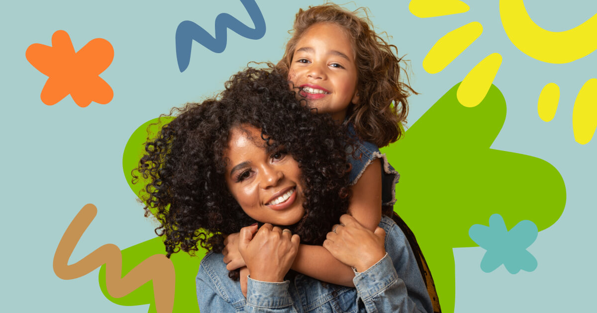
With emojis being one of the most frequently used forms of communication, it has paved the way for the use of illustrated and type-based stickers that won’t be dying out anytime soon.
Characterised by playful and fun visuals, brands use stickers to build upon their visuals and leverage the use of various elements while still keeping things relevant. GIF’s and interactive visuals such as stickers are not exactly new, the first GIF was created around 30 years ago, but the development of new technologies has resulted in a rapid increase of popularity.

Stickers and emojis aren’t just used for the ‘fun’ aspect, they are extremely useful for a variety of things and can help a brand establish themselves;
- To convey emotion without using words
- To give an instant response
- To self-express
- A key marketing tool
- To end a conversation or interaction on a light note
Studies have found that most millennials who often use graphic items such as stickers, emojis and GIFs, admit that these images help to communicate how they think and feel far better than actual words could. What better way to encourage users to visit and interact with your site than simply incorporating the use of stickers, emojis and GIFs?
3. Dynamic Brands
Before the digital age, brands would stick to a strict brand guideline to ensure all marketing tools and branding stayed consistent and aligned with the brand's goals. Since the rise of the digital era, brands have inevitably had to adapt and become more digitised themselves.
Many businesses and brands will still follow a brand guideline, but now there is room for movement, more flexibility to adapt to all platforms of print, digital, and physical media. This is where dynamic branding comes in - defined as a brand with more energy that can physically change or move, reflecting the very definition of dynamism.

Anything from logo reveals, animated transitions, and video titles can create a huge impact on your brand. Here are several ways you can create a dynamic brand on your website:
- Flexible dynamic containers: allowing movement within a set of boundaries for things such as your logo
- Flexible wallpapers: with a fixed logo you can change and alter your wallpaper background - for example Spotify
- Generative content: adapting to current events, trends, holidays, seasons
- Product customisation
- Personalisation
4. Abstract 3D Blobs
3D as a medium will never go out of style. With the different iterations one can come up with in 3D, it makes perfect sense to apply it to anything, from print, to videos and Augmented Reality.
Combine 3D designs with abstract art - a growing design trend that (when done well) uses interesting shapes, colours, and combinations - to create something that means almost nothing but is visually interesting and appealing.

As these ‘blobs’ have become a go-to look for organic shapes, it further evolves with the integration of typography and photography. But there are several things you should consider before using abstract 3D designs on your website;
- Do you have enough space on the page? This style needs plenty of room to be looked at because it can take a while to get into it and take it all in
- Don’t clutter your space with too many abstract 3D designs - this can make the space seem busy and overwhelming
- Think about how you can incorporate this trend as a background element, this seems to be the most popular and effective way to use it
- Think about how you can add an animated element to the visual
5. Heavy Typography
Typography in graphic design is an integral element of the design, by definition typography design is the arrangement of a message or title in a readable and appealing composition.
Using large eye-catching typography is always a sure fire way to get anyone’s attention, whether it’s on a small mobile phone or a huge billboard. More than just making you look, it provides additional emphasis that brands can use to keep your eyes glued.

This type of ‘heavy’ typography is a bold design trend for this coming year. It is a simple but versatile technique that can be used in minimalist or maximalist designs, suiting many different styles.
Moving away from the traditional clean, consistent typography, designers have started to use a variety of sizes, outlines, weights for their typography on their websites, incorporating this into your website design can help to add rhythm and contrast, creating a big personality for your site.
6. Cool Corporate
It can be difficult for a brand that offers a serious service or product, such as banking and finance areas, to find a balance between business and fun. Corporate brands tend to have a bad reputation of appearing outdated, flat and dull compared to new up-and-coming brands with more exciting products and services.
As more and more corporate brands go into the digital world, they find the need to advance with the times while still keeping their heritage. With slight improvements in typography and colours, brands can achieve an updated look without losing their identity that the customers know them for.

If you are looking to improve your corporate brand and website ensure you have checked off the following:
- Select a catchy but not cliché domain name
- Ensure the website is accessible and easy to navigate
- Avoid the use of stock images
- Update the website regularly, keeping relevant
- Ensure your website is compatible with mobile and desktop browsers
- Provide an ‘About Us’ page with interesting facts about the team and add images
- Improve your website's interactive features - add a chatbot
7. Mixing Type
Mixing the typeface you use on your website has been a long-standing trend in web design. Custom type has certainly been more popular most recently as tools for typographers have advanced with new and exciting features like variable and generative typefaces.
Brands that want to achieve the playful yet timeless look use typeface to their advantage by mixing a stable serif typeface with quirkier fonts that enhances readability and screams fun.

There are no set rules to follow when it comes to type in design, but it is important to understand the best practice and general guidelines to avoid going too over the top:
- Combine a Sans Serif with a Serif
- Avoid similar classifications
- Assign distinct roles
- Contrast font weights
- Create a variety of typographic colours
- Don’t mix moods
- Contrast distinct with neutral
- Avoid combinations that are too contrasting
- Use different point sizes
8. Bold Shapes
A great way to block out elements on a canvas is through the use of bold shapes, a trend that emerged in the 1950s. With new logos coming out from the combination of geometric shapes, it makes sense to see these shapes complementing the overall look of the design.
In graphic design shapes are used to add interest and substance to a page. They can be used for a multitude of things in website design: to decorate, they can be symbolic, and they can be used to create patterns and textures.
Geometric shapes and designs have undergone a resurgence over the last few years, and now feel fresh and relevant for 2022 after seeing a few decades of more minimal designs. Instead of busy patterns, there is now a preference for simple, bold, geometric patterns that feel youthful and refreshing.

9. Editorial Layouts
As a subset of graphic design, editorial design is commonly used in the design world. The ultimate goal of editorial design is to make publications visually appealing, interesting, and easy to read. An editorial design should be cohesive, clear, and draw the reader in.
With design and fashion merging over the years, brands have adopted the clean minimalist editorial style layouts made popular by fashion magazines. An iconic hero image paired with a clean sans serif gives the brand an instantly luxurious look.

Below are some top tips for editorial design layout;
- Have a unique style and keep it consistent throughout
- Alter the colour contrast to fit the style
- Make use of illustrations where possible
- Apply the rule of thirds in all design layouts
- Typography is still just as important
10. Riso Colours
Old print production methods are making a comeback. There’s a certain charm to riso colours and its printing method that cannot be simply recreated digitally.
What makes riso printing so different is that the inks are translucent, meaning they can be overlaid with different transparencies to achieve a range of colour combinations producing some amazing results.

With riso printing it is only spot colour based. Unlike digital printing, there is no option to print in standard ink colours like CMYK. Understandably, the trend of using riso colours is on the rise, since the creative possibilities with riso colour printing are endless.
If you are looking to begin designing with riso it may be useful to follow the following advice:
- Look for inspiration both offline and online
- Limit your colour palette to around 1–4 colours per project
- Design and create with layers in mind
- If you’re unsure of how it may turn out speak to your printing specialist and they can offer advice on any alterations to make
So, where will your brand and website design take you?
If you’re looking for a brand refresh or website overhaul to bring your organisation up to speed with the latest digital design trends that engage visitors and delight users, why not start your project with Beyond?

Just a heads up, some of the links in this article may be affiliate links, meaning we may make a small commission on any sign-ups or purchases for the tools we recommend.


